Visualization
Below we highlight the most popular open source platforms for visualizing metadata from historical correspondence. These platforms are suitable even for researchers without IT experience. We are aware that several lists of visualization tools can be found online, however not all these platforms are easily accessible and usable for the average researcher. The four tools below are ones with which we have some experience. There are, of course, other platforms available including Gephi http://gephi.github.io/ and Nodegoat http://nodegoat.net/. Some of these, however, require advanced IT know-how.
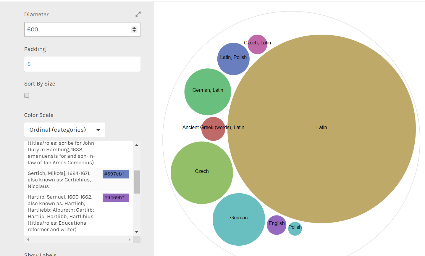
RAW http://raw.densitydesign.org/ – This is a user-friendly tool with an option to export your visualization in different formats. Visualizations are publication quality, and several different formats are available besides a map. The main drawback is the need to test several formats to ensure their suitability for the task at hand. Visualizations are not animated.
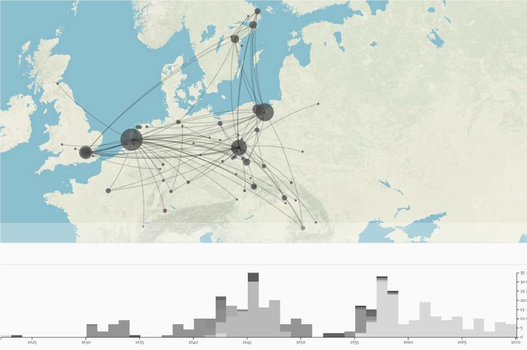
Palladio http://palladio.designhumanities.org/#/ – This is another easy-to-use tool which allows you to create a timeline, filter a timespan or generate a map. There are also options to insert a historical map beneath the data, distinguish between various layers of data and include a graph. You can export data in csv format or a file of the entire project. Exported maps are not of publication quality, however. There are also no animation features for graphs and the labels in visualizations are only visible when clicked on. A video guide to Palladio can be found here: https://www.youtube.com/watch?v=nUUVgWxeATs
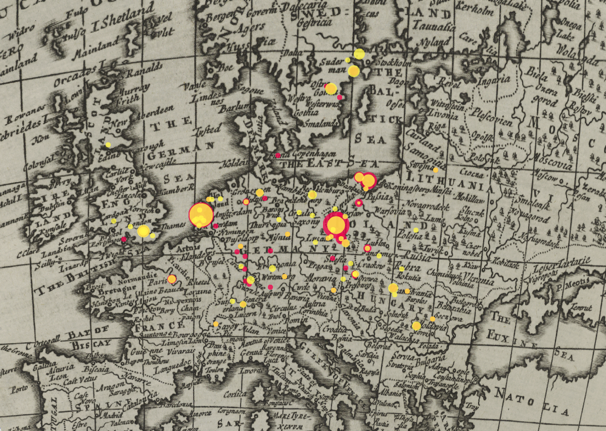

Carto DB https://cartodb.com/ – This is a mapping tool. Users have the option to insert a row of maps including historical ones. You can also choose from different types of visualizations including time animation models. Only one column of geographic coordinates can be used with the tool’s Excel tables. If two columns (e.g. place of dispatch, place of arrival) are needed, the data must be rearranged.
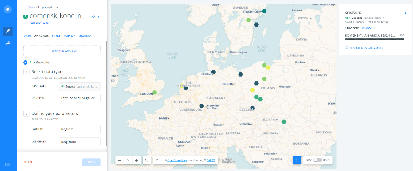
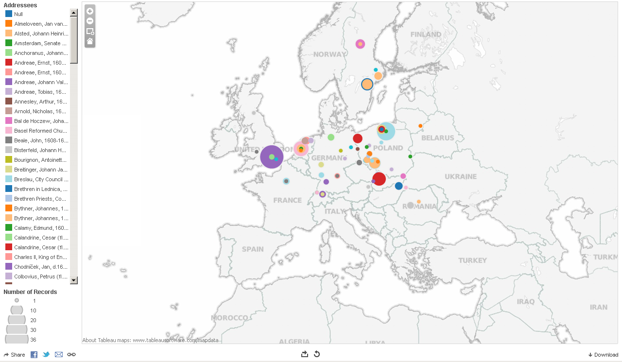
Tableau public https://public.tableau.com/s/ – This user-friendly platform recommends effective visualizations for your data. The drawbacks are the excessive number of settings and the automatic generation of geographic coordinates with no option to insert your own. (This makes the tool unsuitable for datasets that use historical place names since these must be changed into the current names.)
Selected links for historians interested in the digital humanities or the visualization of historical data (in progress)